Geographic Information System (GIS)
Interesting Applications
GIS is a very powerful and flexible tool, and there are many
interesting web sites that display its many applications. The web sites listed
below have tickled our interest in the past, and are great examples of what you
can do with a GIS.
Geographic Information Systems (GIS) integrates
computer technologies, people, and detailed information about location that
lets you visualize relationships, patterns, and trends in maps. GIS skills
are in high demand in the job market, which should be of interest to
students and educators. This presentation presents some examples of how GIS
is used in education, science, business and the service sector.
The Internet abounds with sites that use maps
to display and analyze information from many disciplines. Interested in
finding where Portuguese-speakers live in the U.S.? Which countries export
the most cars or have the highest literacy rates? Want to see how the
relationship between median household income and life expectancy changes
over time in the world? This is a good place to start!
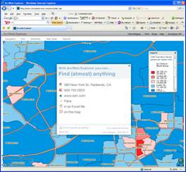
ArcWeb
Explorer takes the model and functionality of ESRI’s more powerful ArcView
software and delivers it via a web-based application. ArcWeb Explorer uses a
series of powerful widgets to help users find locations, create driving routes,
design data-based chloropleth maps and generate demographic reports. Users can
upload their own data from Excel or text files in order to map a series of
locations and download data found using the program to Excel files. Users can
also instantly create web links to the street or satellite maps that they
create, or embed the maps in e-mails. ArcWeb Explorer is a great first step
into the world of GIS.
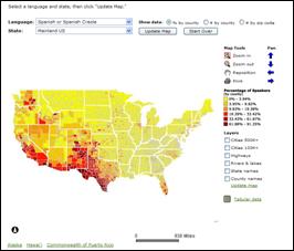
The MLA Language Map uses data from the 2000 United States census to display the locations and numbers of speakers of thirty languages and three
groups of less commonly spoken languages in the United States. The census data
are based on responses to the question, "Does this person speak a language
other than English at home?" The Language Map illustrates the
concentration of language speakers in zip codes and counties. The Data Center provides census data about over three hundred languages spoken in the United States, including actual numbers and percentages of speakers.
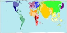
Worldmapper’s
tag line is “The world as you’ve never seen it before” and it’s an apt slogan.
It is a collection of world maps, where territories are re-sized on each map
according to the subject of interest. The maps presented on this website are equal
area cartograms, otherwise known as density-equalizing maps. The cartogram
re-sizes each territory according to the variable being mapped. The particular
method used is one described by Michael Gastner and Mark Newman (Michael T.
Gastner and M. E. J. Newman (2004) Diffusion-based method for producing
density equalizing maps. Proc. Natl. Acad. Sci. USA 101, 7499-7504).
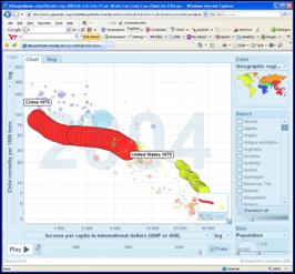
Gapminder is a
wonderful site that can be used to examine differences and similarities between
countries of the world on a series of demographic factors related to public
health. The Gapminder site can help users create great-looking data-based
maps, but its most powerful tool is its Chart feature. Users can create charts
that plot the location of countries on a standard x-y chart, but that’s just
the beginning of this tool. Both the size and the color of the dots for each
country can represent additional fields of data, and then to top it all off,
the charts can be animated to display the change in the data over time. Mere
words cannot describe how cool this is in action! The example chart I display
here plots child mortality by per capita income. The dots are color-coded by
continent and their size is proportional to their population. The red and
yellow caterpillar-looking shapes are actually tracings of how the data for China (red) and the U.S. (yellow) change between 1975 and 2004. If you’re not sure how to use this
tool, the Gapminder website has a series of webcasts available where you can
watch how Hans Roslings, the developer of Gapminder, uses the tool.
Fascinating.
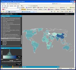
The World Freedom Atlas: The World Freedom Atlas is a
great tool and a thorough source of data for those who wish to learn more about
global issues of freedom, democracy, human rights and good governance. A chloropleth map of the world is used to display data on these topics, using
intensity of color as the indicator. Zachary Johnson of indiemaps.com
collected over 300 variables from dozens of datasets covering the years 1990 to
2006 to populate the maps. As you manipulate the map tool you can learn more
about the individual indicators that are being mapped, as dialogue bubbles pop
up to describe what the various colors represent.
Google Earth Tours
One of the remarkable things you can do with Google Earth is
create virtual tours. Tours are created by saving a series of placemarks
collected in a folder, as a file. The placemarks can include narrative text,
pictures and links to web sites. Authors can share their tours simply by
posting the tour file on the web or e-mailing it to other users of Google
Earth. Tours can be about any subject, as you’ll see from the examples below.
The 1906 San Francisco Earthquake:
Of course, you would expect that a significant geologic event like this would
have some great Google Earth resources, and you won’t be disappointed. The
main page for this USGS project displays a collection of Google Earth Tours,
looking at things such as the path of the fault, the location of the epicenter,
measurements of fault displacement and current fault status. What I found most
interesting was a tour using
Historic
Photographs of the 1906 Earthquake. The photos are wonderfully annotated,
with many “before and after” shots. There are a number of other good Tours on this web site, including one which displays all
of the
earthquakes worldwide that occurred in the past week.
The Paris Art Scene, 1860-1940:
This tour covers a wide assortment of artists who lived, studied and created in
Paris during the listed time frame. The placemarks include museums, studios,
homes, birthplaces, burial places and many, many other locations deemed
significant to the creative process. The placemarks include narrative text and
pictures, and many have links to web sites specific to a particular artist.
San Diego County Fires – KPBS OnLine:
KPBS set up this Google Maps and Google Earth site to display information about
the San Diego Wildfires. It isn’t a Google Earth Tour, per se, but it has a
great collection of placemarks for significant locations from the fire events:
burn area overlays, evacuation center locations, road closures, and other
points of interest.
Famous Photos:
This tour is a collection of placemarks showing the locations where many famous
photographs have been taken. All of the Pulitzer Prize winners from 1944-1977
are included in this collection, along with many other historically significant
pictures.
Losing Georgia:
This
site is a web-based documentary, of sorts, of the effects of development on a
formerly rural Georgia county. The Losing Georgia project has been the
recipient of several awards for use of the Internet and Google Earth to convey
information. By moving interactively between the website and the
Google
Earth data you can learn quite a bit about the effects of
urban/suburbanization on a rural community.
Hank Williams’ Last Ride:
This
Google Earth Tour is devoted to following the tumultuous life of country singer
Hank Williams. The project apparently started out as a documentation of the
car ride taken (as a passenger) by Williams on the night of his death.
Controversy surrounds just exactly when and where the singer died. The first
two-thirds of the tour chronicles Hank’s early life and his musical career.
AntWeb: If you
are at all phobic about bugs, don’t even bother with this site. It is,
however, a wonderful example of using Google Earth to display
the
location of species around the world and provide links to encyclopedic
information. The AntWeb folks have created an amazing Google Earth tour of the
locations of seemingly countless species of ants that includes pictures of each
type of ant along with links to more info. This model could be used to
catalogue any type of plant, animal or mineral, but this collection of ants is
one of the best I’ve seen.
The Works of Claes Oldenburg &
Coosje van Bruggen: Claes Oldenburg, and his
partner/collaborator, Coosje van Bruggen, are sculptors who create large artistic
versions of everyday objects. This is really interesting and peculiar pop art,
and they have been quite prolific. This Google Earth Tour takes you around the
world to see their varied collection of larger-than-life objects, including big
flashlights, clothespins, knives, screws and garden hoses.
How to Create a Google Earth Tour
Google Earth tours are a
great way to introduce an audience to information that is geographically
dispersed. The tours help users travel automatically from point to point on
the globe, whether those points are thousands of miles away or right around
the corner from one another. To date, Google Earth users have create tours
on a mind-boggling variety of topics – from a biographical tour through the
life of Charlie Chaplin, to a fly-over of the San Andreas fault, to tours
that follow the path of significant military campaigns.
More...
Google Earth tours are a powerful,
yet easy-to-use method for presenting points of interest around the
globe and the information associated with these locations. Join us on a
meta-tour where we fly under the St. Louis Arch, visit CSUSM, the San
Andreas Fault, locations of ant species around the world, giant-sized
pop art sculptures, Paris and its artists, and places where George
Washington slept. Whew!